
Direct mail envelopes should have copy written on them. You’re probably thinking, “I thought all the writing went inside the envelope.” Most of it does, but those key points are useless if the envelope doesn’t get opened. After you’ve successfully caught the consumer’s attention with the colors, they then examine what’s written on the envelope. This could make or break their decision to open it. You have just over three and a half minutes for the envelope to do its magic, called the 3:33 rule. You have 3 seconds for the envelope to catch the recipients’ eye, 30 seconds to engage them enough to open it, and 3 minutes for them to read the contents. If they keep the mail after this and respond to your call-to-action, you can call it a success!
Research shows that consumers’ eyes examine four distinct parts of an envelope in a particular order when they receive direct mail. First, they check the address to see who it’s for. If it says anything but their name such as ‘current resident,’ then you’ve already lost them. Second, they look at the teaser copy. Next, the eyes go to the return address and then finally end at the postage. They are merely scanning to see if the mail is interesting or relevant to them. It goes without saying, but always be sure the recipient’s name is spelled correctly and uses the proper title (Mr., Mrs., Ms., or Dr.) or risk losing credibility.
Teaser copy is big and bold pieces of writing on the envelope giving a clue as to what’s inside. It follows the same rules as a headline, to generate curiosity with a provocative statement. A good teaser takes craftsmanship to be effective, so just saying “open me” isn’t good enough. It contains the kind of language your target audience uses. For example, if you are selling Star Wars merchandise, then a good teaser might say “Exclusive offer for a true Jedi inside.” Teasers should urge the reader to open the envelope immediately and not toss it aside for later. Make them want to know more about it.
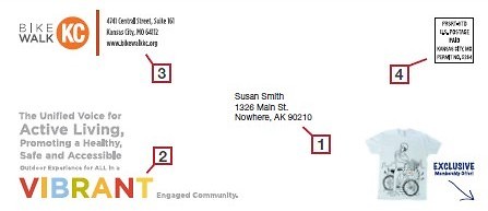
The envelope pictured previously from Bike Walk KC has two teasers. The first one states, “The unified voice for active living, promoting a healthy, safe, and accessible outdoor experience for all in a vibrant community.” Just look how beautifully it uses
colors to express the word ‘vibrant.’ It’s hard to miss. The second teaser hints at a chance to win a free t-shirt and emphasizes the word ‘exclusive,’ giving a compelling reason to open it. It’s important for teaser copy to use catchy adjectives like exclusive, free, new, or valuable. If your offer has a deadline, make sure to mention it in the teaser. If it’s for an event, give the date.
[cmsmasters_row data_width=”fullwidth” data_padding_left=”2″ data_padding_right=”2″ data_top_style=”default” data_bot_style=”default” data_color=”second” data_bg_color=”#cf212f” data_padding_top=”20″ data_padding_bottom=”20″ data_classes=”bg-img-np”][cmsmasters_column data_width=”1/4″][cmsmasters_image align=”left” animation_delay=”0″]9733|https://gonextpage.com/wp-content/uploads/2018/02/white-book-Envelope-Design_151.png|full[/cmsmasters_image][/cmsmasters_column][cmsmasters_column data_width=”3/4″][cmsmasters_heading type=”h1″ font_family=”Open+Sans:300,300italic,400,400italic,700,700italic” font_size=”28″ font_weight=”400″ font_style=”normal” text_align=”left” color=”#ffffff” margin_top=”0″ margin_bottom=”10″ animation_delay=”0″]Learn Effective Direct Mail Envelope Design with this Free eBook[/cmsmasters_heading][cmsmasters_text animation_delay=”0″]
Download this free ebook to find out how good envelope design will ensure high conversion rates and maintain a low cost per acquisition.
[/cmsmasters_text][cmsmasters_button button_link=”https://go.pardot.com/l/891523/2020-11-16/9fd” button_target=”blank” button_text_align=”left” button_font_weight=”normal” button_font_style=”normal” button_border_style=”solid” button_bg_color=”#3b8dc1″ button_text_color=”#ffffff” button_border_color=”#518ff5″ button_bg_color_h=”#ffffff” button_text_color_h=”#518ff5″ button_border_color_h=”#518ff5″ animation_delay=”0″]Get Today[/cmsmasters_button][/cmsmasters_column][/cmsmasters_row][cmsmasters_row data_padding_bottom=”0″ data_padding_top=”0″ data_bg_color=”#ffffff” data_color=”default” data_bot_style=”default” data_top_style=”default” data_no_margin=”true” data_padding_right=”0″ data_padding_left=”0″ data_width=”fullwidth”][cmsmasters_column data_width=”1/1″]
The return address should always be a street address, never a P.O. Box. Consumers should be able to look up the address online and find the company’s location on a map. You may also include your company logo next to the return address to show its authenticity.
Postage is important not just because you can’t deliver mail without it, but because it indicates the message’s significance. Take a look at the next two samples. They are identical except for one feature. Which one do you think looks more professional?
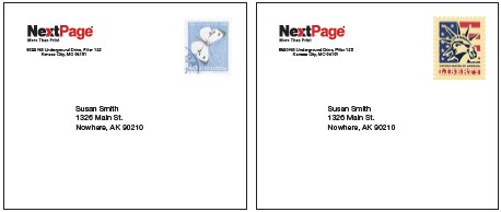
If you chose the one on the right, you’re correct! A butterfly stamp may be appropriate in a letter from a friend, but not from a business contact.
This, my friends, is how you should design a direct mail envelope.
To learn everything else about creating great envelopes, download our free ebook, An Insider’s Guide to Direct Mail Envelope Design.