
Designing booklets, pamphlets, or programs is an involved and detail-oriented process, and even more so when the materials are mass-produced by the thousands. The tedious nature of these complex print projects can make it easy to get stuck on design details and appearance, sometimes overlooking a crucial aspect of print production; setting up your press document. The right design for print not only ensures a smooth production process and high-quality result, but it also helps your press team print more quickly and effectively. Design and prepress considerations are crucial to success. Let’s walk through some print considerations to help increase understanding of how to set up a document and what elements to include when designing for print.
3 Important Factors in Print Production
Effective brochure and book mass production requires many considerations, from binding and page setup to design elements. Prepress considerations ensure that your print project is set up for success. There are three essential factors to pay attention to: creep, imposition, and cutter pull. A misstep in just one of these areas will result in a failed project, so pay attention to make sure you’ll be pleased with the end result.
- Creep
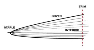
The movement and shift that happens to the margins in the document when pages are folded during the finishing process of a saddle-stitched booklet is called creep. It reflects the distance pages need to move from the spine to accommodate paper thickness and folding. Creep is generally defined in negative or positive values, depending on the direction of the page movement.
- For a negative creep value, the outermost sheet is not adjusted, but the pages on the inner sheets move towards the spine.
- For a positive creep value, the innermost sheet is not adjusted, but the pages on the outer sheets move away from the spine.
- Imposition
The process of arranging a book’s pages so that once the printed signature sheets are folded and trimmed, the pages will appear in the correct order is called imposition. Prepress operators manage printer spreads and imposition from layout spreads. If a document is not correctly imposed (see below example), the finished work will have out-or-order pages, affecting readability.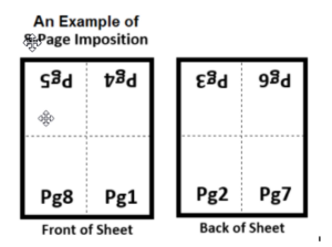
- Cutter Pull
A slight deviation in margin width happens when a large stack of paper is cut simultaneously by a commercial cutting system. This is because the blade cutting into the paper shifts the paper edges slightly as it comes down. While the deviation is usually less than a millimeter, it is crucial to consider when designing. Cutter pull is one of the main reasons it’s rare to see borders or edging art right at the margins: it could be unintentionally cut during trimming.
Other Design Considerations
In addition to flaws during the prepress process, other design elements can unintentionally affect your end result. Knowing how and when to use them is key.
- Watermarks
Any watermark designed for less than 10% ink coverage may not print. In opposition, if the watermark is too heavy it can have an impact on your text’s readability. - Gradients
Gradients should be used sparingly – they’re notorious for showing banding – especially on darker colours. It’s recommended to avoid gradients on business cards and booklets because there is always movement in printing and even a small shift can spoil the look of your results. - White text or objects
When using white text or objects in your print project, ensure that the ‘overprint’ setting is turned off. If overlooked, these elements will disappear when printed and throw off your finished product’s design. - Multiple folds
Allowance has to be made for the paper to fold in on itself, otherwise it will buckle and crease. As you’re designing your next print project, be intentional to add this space. - Linked images
Linked images are a valuable addition to any creative project. When creating a pdf as you design for print, make sure to open the PDF and check the embedded links. If you’re seeing a jagged preview image, it’s time to reevaluate that link. - Reverse text
Light fonts don’t work in reverse unless using a very large point size. Generally, for most fonts, anything less than 8pt is likely to translate smoothly to printed products. - Colour
Some color variation is unavoidable during printing: it’s impossible to perfectly match your chosen colour throughout a run. There’s always an upper and lower tolerance level, meaning the colour will slightly vary lighter or darker within tolerance. If you are designing for a client you need to make them aware of this. What you see on screen is not what you are going to get.”
Ready to turn your well-designed project into results? Contact NextPage to learn more about how our printing services can help.
Contact Us Now for More Information