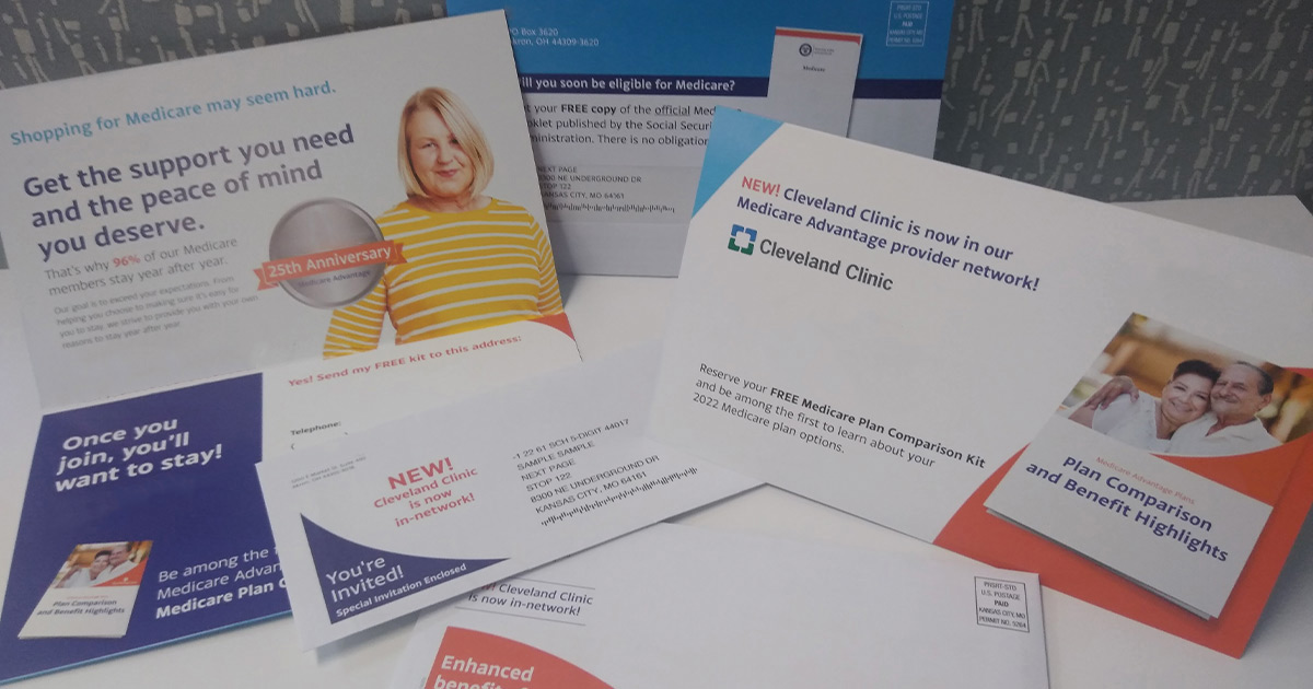
Informational brochures give patients, as well as healthcare users and their families, valuable insights about the care that is being offered. Believe it or not, brochures are still as effective as they were 10 years ago whether it’s used in a lobby or mailed to customers. In addition, it adds to the information given verbally to the patient by the healthcare professional. They are not intended to be a substitute for verbal information. However, medical brochures can help patients and users make informed decisions about their health.
Patient education materials, such as an information brochure, must have a specific purpose. The aim of the brochure can vary according to the topic being covered and the way the brochure is intended to be used (during an appointment with a doctor or ancillary medical practitioner, during a course of treatment or a rehabilitation program or even at home). The intended audience for the brochure will determine the design of the content as well as share the next steps patients and family members will need to follow during their medical journey.
Pick a Topic and Prepare the Materials for Your Medical Brochure
The first step in creating effective informational brochures is deciding on, and then researching, the topic you want to write on. There are many ways hospitals utilize brochures. They may want to provide screening or prevention awareness tips to patients. Medical brochures may have diagnostic or therapeutic information that explains a disease, spotlight treatment advantages and drawbacks or provide tips for managing a chronic disease. Hospitals also share tips with patients and practitioners on how to improve treatment compliance.
The creation of patient education materials will start with the identification of the exact topic, purpose and potential users of the brochure. Once you’ve settled on a topic, you’ll want to do some research by looking at past brochures on the topic or interviewing focus groups of patients to learn what they know/don’t know/would like to know about the topic. Consider what format works best for the age range of your audience. Identify the audience and select the best language to deliver the information. Once you’ve picked a topic and prepped the information, it’s time to think about design elements.
Patient Brochure Design Tips
Here, you will find some highlighted design tip elements to keep in mind when creating your informational brochure:
- Use Plain Language – Write and present information in a manner where the reader can understand and act on it after a single reading. Use plain, everyday words that are easy to follow so avoid slang and acronyms. If you have to use medical terminology, explain the terms as you go along or put the explanations in a glossary.
- Use Small Blocks of Text and Short Sentences – Dense text means patients can be overwhelmed and lose concentration while reading the required information. Keep your paragraphs short with clear, separated chunks of text that encourage those with reading difficulties to continue reading the information. Use headings and paragraph breaks to separate blocks of information.
- Use Backgrounds and Textures Wisely – Patient education material is designed to impart information so don’t include an overbearing background image, texture or color.
- Balance Text and Images – Increase interest in the educational text by including graphics or illustrations to cause the eye to pause when scanning the text. Graphics convey part of the message without the need to include too many words.
- Use Direct Language but Make It Personal – Adopt present and active tense to make sentences more direct. For example, write “the nurse can vaccinate your child” rather than “your child can be vaccinated by the nurse”. Write the text just as you would speak to the reader. Using personal pronouns such as “we” and “you” creates a sense of relatability and trust.
- Choose Fonts that Suit the Audience – Typography is the art and technique of arranging type in order to make written language legible, appealing and readable when it is displayed. No matter how well-written the text, typography which is difficult to read is going to adversely affect comprehension.
- Use Design to Enhance Comprehension – People tend to scan when they read information online or in a book. Your document should have a logical order and structure that helps readers find their way through the information. You can achieve this with reversed text (white lettering on a dark background) or headings and subheadings spotlighted in bold fonts, bullets or number points. Avoid italics and underlining as they can make text harder to read.
Ask our design team about the steps you need to follow to make sure your informational brochures are both effective and educational.
Contact Us Now for More Information
Phone: (816) 459-8404

